h1

Temptation of Saint Anthony | Hieronymous Bosch

January 20, 2022

In the summer of 2019 I was visiting my friend, Brad Walters, in Portugal: he lives part of the year there, in Caldas da Rainha which is not far from Lisbon. The rest of the year he lives in Sackville, New Brunswick, where I live as well. He also teaches at Mount Allison University where I also taught.

Recently, I convinced my good friend to visit Museu National de Art Antica to see Hieronymus Bosch’s Temptation of Saint Anthony (c1500), which is in their collection. I greatly enjoy Bosch’s work and, as with other Netherlandish artists whom I admire, I try to see in the flesh as many of their paintings as I can. Bosch is one of those artists who many people in North America admire while never seeing an actual work because there are very few (perhaps twenty-five in his own hand, while there are numerous copies and forgeries) in existence and many of the best are in Europe. Many like him for his fantastic subject matter that’s nearly unique among European artists of the 15th and 16th centuries. He was certainly popular in my crowd of San Francisco art students in the early 1960s who interpreted him in relation to the LSD drug culture of the time. We got that wrong. His work is more complex than we could understand (but then we got a lot of things wrong. Blame it on our youth).

I got it straight when I took a course in Northern Renaissance painting in graduate school at Indiana University that was heavy on iconography. There is so much more than meets the eye in many early Northern European paintings. Northern European paintings by artists like Jan van Eyck and Hugo van der Goes initially drew me in, by their sheer beauty as art objects, but at Indiana I was taught how to ‘read’ their paintings in tandem with their aesthetic values. This opened a whole new door – or perhaps I should say window – on how I understood their work.

Bosch was born c. 1453 in ‘sHertogenbosch which is now in modern day northern Holland. He died there in 1516. Both his father and grandfather were painters: this wasn’t an unusual pattern in that era as artists were craftsmen, members of guilds, and it was often a family business that spanned generations.

But let’s return to how this is the first in my forthcoming series about Looking at Pictures. There have been numerous moments, in the more than sixty years of looking at art, where I came into contact with actual artworks that have changed my life as an artist and writer. I use the word ‘actual’ because one needs to see the real thing; reproductions, especially those online, do not work and lack the vitality of the physical experience. Virtual art works are like virtual sex on the internet; interesting, but not very satisfying.

It’s often difficult to have a good look at very well known artworks because of the crowds they attract. Too many of these artworks are like the Mona Lisa (shuttered behind glass or roped off), and I’m thousands of kilometers away from my home computer office, making it harder to record or consider my response. I’m happy to say, however, that the Lisbon Bosch has none of these problems of access, as you can enjoy the work with fewer physical barriers, other than its great distance from my home across the ocean.

This triptych sits in solitary splendour, sans glass, on its own plinth in an alcove in the museum. The afternoon that we visited there was only one other person in the room (who soon left, so we could enjoy it in solitude). We could circle the open triptych, so we could view the details of the grisaille work on the front outer panels. These portray the Arrest of Christ and Christ carrying the cross. These are what viewers would have normally seen when the painting was in its original 16th century location. The painting was only opened on special occasions such as feast days and masses.

The brushwork – both on the exterior and the colourful interior panels – are a wonder to behold. It’s freely painted in an Alla Prima technique – rare for its time – which speaks to Bosch’s mastery as an artist. It’s good to remember that he was not limited to the style (as exemplified in this piece, a style he’s perhaps best known for) but also for relatively straight forward paintings like his early Crucifixion (c. 1475-80, to be found at the Musées Royal des Beaux-Art in Brussels) or his later painting (1515) titled Christ Carrying the Cross (at Musée des Beaux-Arts in Ghent). I’ve seen both of these several times, but I digress – let’s return to the front panels of the Temptation of Saint Anthony.

Closed Triptych, Temptation of Saint Anthony, Hieronymous Bosch, c. 1501

Much has been written about strange imagery in this and some other similar Bosch paintings. They are NOT the results of Egotism (a disease brought on by consuming rotten rye bread which results in ‘psychedelic LSD’ hallucinations also known as Saint Anthony’s Fire that was common during Bosch’s time) or psychosis. These are lucid illustrations made by a very devout Catholic artist of the pleasures and dangers of an invisible world made visible during a very dark time in European history. Heironymous Bosch was a member of the Confraternity of Notre Dame (from 1486 -1516) in ‘sHertogenbosch. He painted numerous pictures for them before he was asked to join the group, and the imagery that he painted for the group illustrated their beliefs as well as his own.

It was a time of real unrest in Europe — religious, social and economic turbulence and pestilence, as well. There was a widespread belief in Chiliasm or Millennialism that thought that world was coming to an end (the 25th of February, 1524, to be exact). We need to remember that astrology was regarded as a science, that there was fervent belief in actual demons and a certainty that Witches’s Sabbaths were also taking place. All of this can be seen in Bosch’s work.

Open Triptych, Temptation of Saint Anthony, Hieronymous Bosch, c. 1501

Religious art, such as this work, illustrated for several hundred years the teachings of the church to a generally illiterate society, but often contained an iconographic code that could be read by an elite group of scholars and clerics. The stories, at times, were centred about Judgement Day and or the Second Coming when the just would be rewarded by bodily elevation to Heaven and sinners damned to Hell. This is the main purpose of The Temptations of Saint Anthony. If you fall to the temptations that were offered to St. Anthony rather than resist them as he did you surely would be doomed to the eternal suffering of Hell. The images of flying fish ridden by mermen, witches, strange animals, birds, and demons were very real to 16th century viewers of Bosch’s art – not to mention the actual temptations of the flesh via sexual inducements, and that of worldly goods.

As an atheist, I am not too bothered by Heaven and Hell, but I have always been drawn to religious art, music and the writings of many Christian philosophers (if for nothing else than their devotion that I cannot share, but can admire). I don’t want to get into an argument about the obvious shortcomings of the Christian Church which is the reason I am an atheist. I have no interest in, nor will take up the argument. What I see, and appreciate, in The Temptation of Saint Anthony by Heironymous Bosch is not unlike listening to the religious music of J.S. Bach. They both manifest a beauty that moves me to a better place than I deserve.

© Virgil Hammock, Sackville, NB Canada, 28 December 2021

h1

WHY BLACK AND WHITE STILL MATTERS

December 7, 2021

It can be argued that the visual world was reduced to black and white when the photograph of a man getting a shoeshine in Paris, View of the Boulevard du Temple, was taken by Louis Daguerre in 1838. It is likely the first street photograph that included people. Daguerreotypes changed the way we see the world. This is not an essay exploring the history of photography, but a reflection on the nature of reality. Portraits were painted but limited to those who could afford them before photography became commonplace in the second half of the 19th century. Knowledge of what places actually looked like was equally limited. This new reality was in black and white. While the statement about being as clear as black and white is about newsprint, black print on white paper in newspapers meant something was obviously true. The same thing can be said about peoples’ trust in photography, and in the beginning it was exclusively in black and white. Of course, newspapers can be blatantly false and photographs doctored, but most people trusted photographs to be true images of reality and certainly trusted them more than they trusted newspapers.

I grew up as a black and white photographer. My first formal training, at the age of 18 in 1956, was as a combat photographer following a sixteen-week course at the U.S. Army photo school. I didn’t see combat, but they certainly taught me how to take a picture. Following my discharge, I enrolled in art school as a photography major. That was not to be as I changed my major to painting and later put most of my efforts into writing about art, but I still maintained a strong interest in photography as an art form. Now in my dotage, I am trying to take pictures again.

Looking at Ansel Adams’s book The Negative recently, I realized how complex photography could be at the time I was studying it. I learned the Zone System at The San Francisco Art Institute, and then The California School of Fine Arts (where Adams had taught) from his student, John Collier. Today all you have to do to get a pretty decent exposure is set the dial to A and push the shutter button. At one time I had three different exposure (light) meters—reflected, incident, and spot—and from my army training I could accurately eye-ball an exposure. This isn’t to say that this knowledge made me a better photographer – good photography is always about the photographer’s eye or vision.

To me, good black and white photography is straight photography, and by that I mean full frame with a good exposure; what the artist saw in their viewfinder. Perhaps a little cropping here and there, but not the wholesale manipulation one sees by artists using programs and apps. Perhaps that makes me a purist, though I am not stuck on the idea that good photography must be made by film cameras with images processed in darkrooms. Great black and white photographs can, and are, taken with digital cameras and printed on quality printers. A good example is to be found in The Ansel Adams Wilderness: Photographs by Peter Esstick published in 2014 by National Geographic. Esstick, using a digital camera, gives a new interpretation of Adams in his landscapes. The results are stunning. But many good photographs are taken today with smartphones. For example, I have a phone app, Lenka, that simulates an old Leica 35 film camera and does a pretty good job of it. Art is not about equipment. It is always about the artist.

I don’t want to seem that I am ‘stuck’ on the perfection of Ansel Adams. There is also a type of black and white photography that is personified by the work of Walker Evans, Robert Frank and others where a magic moment is captured forever by an artist’s vision. Their work sits at the pinnacle of street photography and it is hard to imagine it in anything other than black and white. They were the kind of photographer that I wanted to be but could not because I lacked their eye and their talent. Another problem I had with taking street photographs is that I never had the ability to make myself an invisible observer. Frankly it is even more difficult today to be an Evans or Frank when so many people object to having candid photographs taken of themselves as an invasion of their privacy, even as their lives are being constantly monitored by their own electronic devices.

Art is always defined by its time. It can be no other way. The Great Depression of the last century was elegantly recorded by photographers who worked for the American government funded Farm Security Administration, among them Dorothea Lange, Carl Mydans, Walker Evans, Ben Shahn and Russell Lee. Their work stands the test of time. When thinking of the Depression, one thinks of their photographs. Another fine example is the war photography of Robert Capa, who died following his passion for truth. This golden age of photojournalism, in the mid twentieth century, was nearly all recorded in black and white.

My own photography is about light, darkness and empty spaces. Sometimes it is about a place where people have been or are about to occupy. Often it is about the play of light across a floor, or reflections, or as common (but visually engaging) as the shadows across a washroom sink. I know when I see a picture that I want to take. It just jumps out at me. I normally envision the image as square or 1:1.5 format, the result of working with 2 1/4 by 2 1/4 or 35mm cameras many years ago. And I do see them in my mind, before I take the picture, in black and white. I still think of shoots in terms of twelve or thirty-six exposures. Old habits die hard.

Many of my friends tell me that the age of the standalone camera is over—dead. It is true that the production of real cameras is dropping, but the proclamation of their disappearance is premature. The same friends ask me “why black and white when you can have glorious colour with the same push of a button on your smartphone?” I don’t consider these people photographers. They are people with smartphones that happen to have cameras.

Everyone was talking about the death of painting when I started art school in 1959; and yet painting still seems to be around, and shows no sign of any demise. Today we hear many stating that Art itself is dead. There is no danger of that happening as long as we have people around with two eyes and the means to record a moment in time, whether it be cave painting, photography or some other medium we have not even yet imagined.

Meanwhile, I will continue to think in black and white.

h1

Sophie’s Choice — A Muse for Stephen Scott

October 20, 2021

A muse, according to the Canadian Oxford Dictionary, is a poet’s inspiring goddess or the source of inspiration for creativity. Fredericton painter Stephen Scott is not a poet, but he has found his muse and certainly an inspiration for creativity in his wife Sophie Thériault Scott. Stephen has known Sophie since 2000 and they have been married since 2010. She has been the subject of many of his paintings since that first meeting, but being his muse is far more than being a model for him to paint. Her presence in his life has affected all of his art. After all, that is what a muse is supposed to do.

The history of art is full of the influences of muses not only in the visual arts, but in literature and music as well. Two painters who remind me of the relationship of Stephen and Sophie are Pierre Bonnard and Marthe de Meligny; and Alex Colville and Rhoda Wright. Bonnard and Colville saw and painted their wives not only as models, but as the unchanging object of their love as Scott continue to do. Artists can, and some do, live their lives as hermits although this seem to be more the case with writers than painters. I, as a writer, can have an imaginary muse, but it is not nearly as satisfactory as a real breathing one, although likely less complicated.

Over the last two years, due to COVID-19, Stephen has been more or less housebound in the company of Sophie which makes her participation as the subject of his painting even more normal than before. His studio is in his house (in the made over living room), and he is never more than a few steps from his easel. Sophie, who is an art teacher, has been home more than normal because of Covid. The opportunity for the two to come together through his art was the natural outcome.

There is another strong reason for Stephen to regard Sophie as his muse as she nursed him through a serious bout of cancer in 2013. Without her devotion I doubt that he would have survived, much less come back an even stronger artist than he was before. When I mentioned to a friend that I was writing about an artist’s muse one reaction I got was that muses were “sexual objects for the artists” and “how about men as muses to women artists”. The relationship of a muse is far more complex than being an object of sexual desire and there is no reason a man cannot serve as a muse to a woman. This leaves aside the option of same sex muses and artists. The idea of muse is more in the mind of both the artist and the muse.

Stephen’s painting Nude on Sofa brings to mind Francisco Goya’s The Naked Maya (c. 1797-1800, Museo del Prado, Madrid), which reportedly is a painting of his great love and muse, the Duchess of Alba. While there is some debate as to whether the Duchess actually sat for the painting, there is no debate that Goya painted her several times and that their relationship is spelt out in his 1797 painting Portrait of the Duchess of Alba in Black (Hispanic Society of American, New York), where the Duchess points to the ground where she had traced the name Goya on the ground with her shoe. The point I am making about Stephen’s paintings of Sophie and Goya’s paintings of the Duchess of Alba is that the sitter is important in these cases—even though Stephen does not name her in his titles—as a particular individual rather than just a nameless subject for a painting.

People do not have to be art historians or art critics to enjoy or be even profoundly moved by art works. A deep knowledge of an artist’s life and the iconography of his or her work can certainly help in the understanding of their work. Stephen seldom identifies the subjects of his figurative works titling them in general terms like, Man in a Yellow Shirt, Hotel Bedroom, Woman Standing and so on. His circle of friends knows a painting of Sophie or other familiar subjects when they see them. Indeed, I am the Man in a Yellow Shirt. In the end it does not matter; people who do not know Stephen see them just as paintings and that is a good thing. I’m not sure that you will enjoy a Rembrandt portrait more of if you know it is one of Jan Six (1654, Six Foundation, Amsterdam). It is just a damn fine portrait of a man. The same goes for Man in a Yellow Shirt, but I am a good looking guy, nonetheless.

Keeping with Rembrandt, muses, and Stephen Scott. Rembrandt’s second wife, Hendrickje Stoffels, not only served as his model, but nursed him through bad health as well. However, I would like to compare Rembrandt’s painting of her Woman Bathing (1654, National Gallery, London) to Stephen’s painting of Sophie, The Stream. On the same topic, while Stephen’s painting is much looser in its painting style, the latter Rembrandt painting is the among the best of the artist’s free use of paint. However, the real point of comparison to Rembrandt is Stephen’s Self Portrait After Radiation. The self reflection of Stephen’s painting of himself at a particularly painful time in his life is very much on a par with late Rembrandt’s self portraits.

To end on a positive note, there is Stephen’s double portrait of himself and Sophie, Northern Gothic. Besides being a nod to Grant Wood ( American Gothic, 1930, Art Institute of Chicago.) it illustrates their firm partnership as man and wife and the real meaning of muse.

© Virgil Hammock, Sackville NB, Canada, 11 October 2021.

(An exhibition of Stephen’s Scott’s work opens on the 5th of November and runs until the 17th of December, The Uncertainty of Seeing: Painting of Stephen Scott, at the Saint John Arts Centre in Saint John, New Brunswick.)

h1

Practice?

May 25, 2020

All I can say when someone refers to an artist’s ‘practice’, I scream. I always thought that art students practice in art school and when they become good at it, they become artists. I know that lawyers, and dentists have practices, but that usually refers to the fact that they have an office somewhere where their customers go to be parted from their money. An artist, like the poet, is an honourable calling and does not need an office unless you want to call a studio an office.

I can picture my practice now as an art critic and I do have an office that I prefer to call a library. Anyways it is a room full of books. I will hire a receptionist and artists could call in to make an appointment. “Yes, there is an opening next Wednesday at 3:15.” Then the artist would drop by my practice and we could exchange art talk for thirty minutes. After that they pay my standard fee. (Actually, my standard fee for bullshit, up to now, has been free.) What a business model. After all, I do have a BFA and MFA, so I must be entitled to a practice.

Speaking of visual arts degrees. I understand that a number of universities in North America and Europe are offering PhDs or other forms of doctorates in studio ‘practice’ (that word again). Another chance for over certification in the visual arts. Granted it gives universities longer time to make money from art students in these times of astronomic tuitions. My worry is that these degrees will become mandatory for teaching positions in universities and art schools. I had a look recently at what it would cost today to get my BFA (San Francisco Art Institute) and MFA (Indiana University) paying today’s full tuition. It would be in the range of $320,000. Add three or four more years for a PhD and it could easily be more than a half a million dollars. It would not leave a lot of room for a newly minted Dr. Artist to buy a tube of paint.

Reading the information that I have received online for some visual arts studio doctorate degrees, mostly from Europe, I would put them on a par with executive MBAs. Give us some money, a lot of money, and we will give you some letters to put behind your name and a nice framed diploma, perhaps from the University of Lower Molvanîa. How much nicer it would be to own an art work made by Dr. Smith than one from Pete Smith. For some this over-certified art stuff might work. Already I have seen work in various art fairs, another scam, described by critics as MFA art and it was not intended as a compliment. Think how much more money could be suckered out of the stupid with DFA (Doctor of Fine Arts) art.

It would be nice to think that more years in a university or art school would result in better art. That is not likely. I still remember a visiting artist telling my students that why he went to graduate school to get his MFA was so that he could learn how to talk about his art. In his case it was true because his paintings on their own said nothing. This true tale happened at least thirty years ago, and I am sure that art students are still learning to talk about their art not only at the graduate level, but at the undergraduate level as well. It would be wonderful if all contemporary art spoke for itself.

I do not know how many art galleries I have visited over the last fifty years and been greeted by empty, no art walls that instead feature a manifesto pasted to the wall by an artist telling why there was no art. This was sometimes backed by a statement by the gallery’s director or testimonial of the artist’s genius by an art critic. I have personally seen this phenomenon worldwide and a little of this bullshit goes a long way. A long time ago I gave a paper, in Poland I think, titled WYSIWYG (What you see is what you get.). I stand by that statement which, of course, means if there is nothing there, then there is nothing there. Look, if someone wants to pay big money to buy a certificate of ownership of an idea from an artist of duct taping a banana to a wall, who am I to stop him? But beware there could be limited editions, and there was in this case, and there are an awful lot of bananas and rolls of duct tape out there.

Marcel Duchamp has a lot to answer for, but he was a pretty good painter and not a bad chess player. Most of his jokes are over a hundred years old and were funny at the time. I think that he would find the idea of him having an art practice ridiculous. Remember would-be-artists, that practice makes perfect.

Bicycle Wheel — Marcel Duchamp

©Virgil Hammock, Sackville NB, Canada, 25 May 2020.

h1

The Picture is the Thing

May 19, 2020

Recently, I reposted a colour photograph Pablo Picasso talking to Brigitte Bardot taken in 1956 on Facebook. The post was immediately bombarded by replies on how awful a man Picasso was and hence a bad artist whose art we should never look at again. They surmised from the photograph that he was hitting on Bardot and hoping to get laid. This surprised me, but should not have. I posted it because I thought he was a rather nice picture of two important French people in the mid 20th century.

Picasso was sitting on set of stairs several feet away from Bardot, apparently talking to her. There was no way from looking at the photograph that you could grasp the conversation, nor was there a caption telling what was going on, but this did not stop people from guessing and most vilifying Picasso in the process. I know that a picture is worth ten thousand words, but this one could have benefited from a one sentence caption to wit, Picasso: “Brigitte would you like have sex with me? The wife is away.”

When I tried to explain that I thought that Picasso was a rather important artist whose art changed the course of 20th century art, they would have none of that. I admitted that he was not a sensitive metrosexual and would not meet the high moral standards of the first quarter of the 21st century, in truth neither would I, but that was not enough. I think that the general idea is that we should dig up his bones and jump on them.

If there is one major theme that I have been writing about over the last fifty plus years is that the art work is the thing and the artist only makes it. Most viewers only have a vague idea of the character of the artist who painted a picture they admire and it gets increasing vague the older the painting is. This operates on the theory of what you don’t know doesn’t hurt you or ignorance is bliss.

Let’s look at Picasso. If he had only painted Guernica he would have earned a place in art history, but add on, La Vie, Les Demoiselles d’ Avignon, his Blue Period, Rose Period, and Cubism and it is hard not to agree that he was an important and great artist despite his character faults. Who do you punish by not looking at the work of this dead artist? I am pretty sure that being dead puts Picasso out of the picture, if you will forgive the pun. There is a really long list of artists of questionable character who who have produced great art and let us not leave out Anonymous who may or may not be questionable.

Aesthetics are pretty much a dead issue into today’s art criticism not to mention art itself. It has been replaced by curators and critics, produced by university graduate programmes, who fancy themselves as social scientists. They see art as a means to push their ideas for a progressive society. There are roots for this in the writings of Arnold Hauser in his The Social History of Art* which I read in 1961 and thought had some merit. But Hauser always put the horse before the cart in that art led theory and not the other way around. There is a case to be made for art in history rather than art history and this is what Hauser did. Great art gives us a reflection of its time, but does so on its own terms and those terms are that of the artist.

Where things get fucked up is with the theories of Post Modernism and, in particular, Post Structuralism. Here the cart is before the horse. Literature is reduced to text and art works become objects to advance theory. The result is often unreadable articles and books, sometimes are even more unreadable when they are translated from an other language, like French. Post Structuralism is really a linguistic theory goes back to the ideas Ferdinand de Saussure and advances with by Michel Foucault, Jacques Derrida, Ronald Barthes, and Jean Baudrillard. What any of this has to do with the visual arts is beyond me. Not that I did not try to figure it out, but a lot of fellow academics in the arts seem to have made a career where I failed as Post Structuralists and sometimes as well Neo-Marxists (not that I have anything against Marxism). But here we are with lot of bad art art made cowed artists who are worried about appropriation, gender, imagined past bad behaviour (you name it), and being called out by some nit-wit on social media or lectured to by a self righteous Social Justice Warrior. It is a wonder that anyone would want to make art these days.

What we need is a return to the day of ‘up yours’ art. Make unapologetic art and if someone, or a group of someones, do not like it, it’s their problem. Of course, there is the chance of truly offensive art that should not see the light of day, but even then care should be taken. A look at the criticism that most art movements endured, be it German Expressionism or the Group of Seven should give pause to excessive censorship. We need art that challenges us that includes art made by artists of questionable character. Let us not forget that Caravaggio was a murderer. As far as I know Picasso was not.

© Virgil Hammock, Sackville NB, Canada, 18 May 2020.

* Hauser, Arnold, The Social History of Art, Vintage Books, New York, 1958 (Four Volumes paperback. Originally published in Germany in 1951.)

h1

Fade to Black

May 10, 2020

High culture has pretty much disappeared along with the dress code. I never thought fifty years ago that nearly all people would be dressing like slobs in 2020. Yet, here we are with people wearing pyjama bottoms when they fly even in business or first class and men wearing baseball hats and sweat shirts to funerals. A walk down the main street of the small university town where I live, and yes, it even called Main Street, exhibits a parade of dull, darkly dressed people in t-shirts, jeans, and of course base ball caps. Admittedly, the more fashion minded wear their caps backwards. This has nothing to do with class. The rich, middle class, and poor are all dressed the same. The difference might be that some of the academics and hipsters think that their branded rock themed t-shirts are ironic while the others might actually like the bands their t-shirts advertise. We are, after all, a university town. Sadly this form of dress seem to be a world wide style. Where men have to ‘dress up’, say in government or business, they all seem to have the same dark blue, single breasted, suit, white shirt, and a dismal tie. Women in the same professional classes are equally, dreary dressed.

Is this important? Yes. It signifies carelessness and a race to the bottom not only in style, but in high culture. It is hard not to think of Edward Gibbon and his The decline and fall of the Roman Empire and the thought of the Roman elite dressing like the Barbarians just before the shit hit the fan. True, we live in a time of high technology, but that has brought us the likes of Facebook and with it universal stupidity on a global scale. I have to admit that I dabble in social media, Facebook included, but all that proves is that I have morbid fascination with an endgame and my own brand of stupidity. I am writing this in my house with floor to ceiling book shelves full of books that I have actually read and hundreds of CDs and LPs of classical music. Friends think that I am crazy and that all that information could be on a hard drive or couple of flash sticks, but that would not be same as my things provide me with a warm physical womb to which I can retreat. If that is not a sexual metaphor, nothing is. Others just think that I am a crazy old man living in the past. Both my friends and the others have it at least partially correct. I am deranged by most people’s standards. The good part is that I am harmless.

I have loads of time to reflect on the ins and outs of the decline of high culture as I, like a lot of people, am under a table in my home, hiding from the modern day Apocalypse of COVID-19. I am told that being over eighty that. because of the virus, death is just around the corner and that I should not answer the door as it might be the Grim Reaper. I am listening to Mozart’s Piano Concerto # 21, KV 467, a sad one, right now on streaming radio from Venice which is just more reason for melancholy. Things did not end well for Mozart, but he did add a thing or two to hight culture. Sadly, far too few listen to Mozart and his ilk these days. Most people I know appear to want to hear Alternative or Classic Rock and our national radio station, CBC Music, gives them ample opportunity to do so. I am happy for them, but not so much for myself.

So what is this high culture that I am lamenting its decline? It is about the arts from around the Renaissance, with roots in Greco-Roman and Judaic cultures, and leaving aside the Dark and Middle Ages, until the late 20th century. Sometimes fondly refereed to as Western Civilization.* This concern of its loss would certainly identify me as a hopelessly out of date elitist. I am guilt as charged. I fully understand that there are major problems with what is called Western Civilization. It has a long. history of misery, war, and racism. In my lifetime, I have lived through periods of time that I wish I had not. The world is not a pretty place and it never has been.

My concern is with the things that people have made, and made well, during this period of high culture, be it literature, music, or the visual arts and now seem to be in a period of decline in quality. It is perhaps due to a democratization of the arts where everyone is an artist and everything is art; add to that the demonization of the concept of genius and result is a surfeit of mediocrity. Let me be clear: art is an addition to a society. Paintings, music, and novels do not so much make a society as record it. Wars, and their misery are not stopped by art, but Goya’s paintings and prints certainly pointed out their shortcomings. Shostakovich’s 7th Symphony, The Leningrad, did not stop the siege of Leningrad by Nazis, but it inspired its defenders who did. All Quiet on the Western Front, a novel by Erich Maria Remarque, defined the horrors of World War One. Of course, despite Remarque’s novel, The War to End All Wars was followed twenty years later by World War Two.

Art, the making of art, is hard. Art is the result of study and practice—much practice. The idea of genius, while genuine, is overrated and is used by the less talented artists to explain why their own efforts fail to match the work of masters. Renaissance painters did not have magic paint brushes or secret recipes that made their paintings so different in quality than much of those in contemporary art. They just knew how to paint better. It was the result of long study and practice. Writing a symphony is hard as is writing a good novel. The men and women who have put their work, time, and effort into high culture have helped define what is noble in civilization. We need to remember that we are never far from barbarism. Great civilizations come and go and are often followed by periods of darkness. I think that we are pretty close to a new dark age, if not living in one already.

©Virgil Hammock, Sackville NB, Canada, 7 May 2020.

*Yes, I know that there are other civilizations than Western Civilization, but one civilization is enough to worry about.

h1

Mastering the Good — Stephen Scott

April 27, 2020

Man in Yellow — Stephen Scott

There is no question that these are dark time times and dark times call for light. That light is beauty. The beautiful comforts us in times like these when life itself is in question. I have been writing about the beautiful for well over half a century. Generally, I have been making my case for beauty through the visuals arts. Of course, the beautiful exist in many forms and all of them are good. Here I am going to limit myself to painting and to one painter who creates beautiful objects, the New Brunswick artist, Stephen Scott.

I chose Stephen because I know him and his work very well. You can check out a very long conversation that I had with him on my blog under the heading Stephen Paints a Picture which resulted in an exhibition of his work at the Beaverbrook Art Gallery in Fredericton, New Brunswick. While you are on my blog you might want to read my post Art and Beauty that is also the name of my blog. Both of these articles were long before the current crisis with COVID-19.

Stephen and I often talk in circles and we talk a lot. In the current crisis our conversations have been limited to phone calls and FaceTime. Of course, we usually talk about what is art. He is, and as always been, a realist painter and I am a champion of realism, but also have a fondness for abstract and non-objective painting. I have alway been under the impression that content in art is secondary to its physical qualities. Here Stephen and I often part ways. I believe that I have to be attracted to a painting first by its qualities as an art work, craft and beauty, before I move on to content. This does not mean that content is unimportant. Content is often key to an artwork’s place in art history. Paintings can be beautifully done and totally devoid of serious meaning such as much of 18th century British portraiture. However, I have problems with the reverse. A badly done painting, regardless of its content, remains bad art or, as I would maintain, not art at all. An example would be Damien Hirst’s Spot Paintings. Damien Hirst and. his American counterpart, Jeff Koons are not artists, but con men. If you think they are artists I suggest that you stop reading this article here as you will not like it.

Stephen has often told me what separates art from non-art is content then goes on to use his painting as an example. I reply that a landscape is a landscape and its content is landscape. His painting Southside is a view of a bridge crossing the Saint John River in Fredricton. It is very wonderful painting and it is of a particular place, which is un-named in the title, but that place would be of little importance to people outside of Fredericton or New Brunswick, but they may still like the painting for its quality as a landscape. Viewers generally like paintings because they hold up as works of art even if some of them do not consciously know why. They know intuitively where things should be in a painting as they read it left to right and from the bottom left to the top right. North Side certainly checks off all those boxes. It reads well as a picture. In short it is a good painting.

Southside — Stephen Scott

To be fair Stephen and I have a different definition of the term content. I believe that when he speaks of content he is referring to the choice of subject matter that he finds worthy to paint. My idea of content is more its philosophic and or political meaning. Stephen has a good point because because it is up to his vision what to paint in a picture be they of a landscape, city scape, street scene, or of people. If an artist is using their art to illustrate a belief like their dislike of war it is something else again. Take the work of Kathe Kollwitz say compared to that Claude Monet. Both fine artists, but very different in their approach to art making. I must admit that I am in the Monet camp as I like ‘pretty’ pictures, but that does not take away from the quality of Kollwitz’s art.

Another point that Stephen has forcefully made to me about the difference between art and non-art is the idea of intention. A real artist has the intention of making art. Art making is not intuitive, but done with intention. Granted passable art can be made by a elephant painting with a brush in its trunk rather like a thousand monkeys typing Shakespeare, but it is not the intention of the elephant or the monkeys to produce art. It is more likely to gain peanuts. Hopefully a good artist would not need a thousand tries to get a passable painting. A good artist sets out each time with the intention of making art.

I have over the years watched Stephen painting as I have had other artists, but it is he that I have watched the most. I have seen him work from a pencil sketch, to an oil study, to a finished painting. He makes strenuous demands on himself. I have seen him work all day on a painting and in the end wipe it all out and start over the next day. This sometimes over my objection that what he was destroying was perfectly good. In the end his judgement was sound, but it is hard to watch. Major paintings sometimes take months to complete. An example, other than the portrait of myself described in Stephen Paints a Picture (Man in a Yellow Shirt), is Tableau with Three Figures.

Tableau with Three Figures — Stephen Scott

This painting is the result of a series photographs that he took at my 80th birthday in the summer of 2018. ( Stephen seldom works from photographs, but directly from observation.) It’s a evening scene through a glass door of three people sitting at a dining room table. The figure in the centre, shown from the back is myself, the woman to the left is my friend, Gina Bradet, and the other partial figure across from me is another friend, Chris Mackay. The painting is very different from its photographic sources and in every way better. Anyone who knows the three of us in the picture would recognize us immediately even though the figures are very broadly painted. The lighting comes from several directions, but it all seems correct. The colour of a mid-summer evening sparkles. I watched this painting go through several cycles and. in the end, it is a beautiful painting.

To return to my earlier point about content in Stephen’s work. Tableau with Three Figures is not titled Virgil’s 80th Birthday Party, but it speaks to a more universal theme that of three friends enjoying each other’s company on a Sunday evening. This event could be happening anywhere. It reminds me of an Ingmar Bergman film, Smiles of a Summer Night, but that is just me showing my age. How we look at a painting depends on our own history. As an art critic, art teacher, and artist I look at a painting in a different way than an art lay person. Different, not better. However, I think that most viewers will enjoy looking at Tableau with Three Figures and gain something from doing so.

Northern Gothic — Stephen Scott

Stephen’s Northern Gothic is another work that operates on many levels, but can be easily understood by many as just a beautiful painting. He would be annoyed by me using the words ‘just a beautiful painting’. It is a compliment as contemporary beautiful paintings are few and far between and Northern Gothic is obviously far more complex in its meaning and intention. The title is, of course, a take on Grant Woods 1930 painting American Gothic, but there the resemblance ends. Stephen’s painting is far more painterly than Woods’s work. American Gothic is social commentary and Northern Gothic is not. Stephen’s painting is a self portrait with his wife. It is a mirror image painted from life. The history of art is full of images of artists and their wives. The best examples are by Rubens and Rembrandt. Stephen is very aware of art history and admires flemish painting as do I. The use of space is more complex in Northern Gothic than in American Gothic and its mood is far darker. It is hard to figure out where things are in Stephen’s painting, but it seems to all hold together and make sense.

Painting is artifice and serves no useful purpose. They are objects placed on a wall that are meant to deceive or, at least, that is what Plato would have us believe. Plato had many useful ideas this was not one of them. Art, of course, serves a purpose, in fact many purposes. Chief among them is to satisfy the soul. We need satisfaction more than ever in these trying days COVID-19. One way is making art and another is looking at it. Some of us can do both. At the moment most of us are isolated in our homes and art galleries are closed. We are reduced to viewing art by digital means that is a poor way of looking at the paintings of Stephen Scott where their physical presence is so important. We must rely on our imaginations and wait for the time when we can see his, and other artists, work in person.

Let me leave you with the words of Immanuel Kant from his Critique of Judgement, part 51, Of the Division of the Beautiful Arts: “Among the formative arts I would give the palm to painting, partly because as the art of delineation it lies at the root of all the other formative arts, and partly because it can penetrate much further into the the region of ideas and can extend the field of intuition in conformity with them further than the others can.”* Take that Plato.

* Philosophies of Art and Beauty, Edited by Albert Hofstadter and Richard Kuhns, The Modern Library, New York (Random House), 1964, pg. 331.

©Virgil Hammock, Sackville NB, Canada, 25 April 2020.

h1

Concerning The Spiritual In Art

January 23, 2019

Concerning the Spiritual in Art is the title of a small book written in 1910 and published in 1911 by Wassily Kandinsky. The reason I bring it up is because I believe that it has important things to say about art that are just as relevant today as they were in 1910. When I say a small book, I mean it. The current copy I have just runs to sixty-five pages of rather large print. I first read this book as an undergraduate in the early 1960s. Those were the times when everyone was looking for the spiritual though mainly through the use of drugs or a superficial understanding of Eastern philosophy and/or religion.

Kandinsky’s book turned out to be a text more on how to make art than a primer to instant bliss. His ideas of the spiritual were internal to him and turned out to make a lot of sense to me. When I first read the book, he was already he was already a favourite artist of mine. While I was in high school I had a framed large reproduction of one of his abstract paintings in my bedroom. I had lived in England during my first two years of high school and had seen his work in galleries there and in France. I fell in love with his work, and that of Paul Klee, an artist that he worked closely with. I still like their work even through most people think that I have a bias for realist art. That is just not true. I have a bias for good art which both Kandinsky and Klee produced in droves.

I have been having ongoing discussions with friends, both artists and others, about how good art comes about. The subject of abstraction came up. This led back to Concerning the Spiritual in Art and a rereading the text. I bought my current copy a couple of years ago when I was writing a text on abstract art in New Brunswick and could not find a copy in my library. It was not easy buying a copy. It appeared to be out of print. I ended up by having a copy printed by Kessinger Publishing’s Rare Reprints. Believe it or not this service is not expensive. I think I paid around ten bucks for the book.

I assume that many of you who are reading this article know who Kandinsky was and his importance to the history of art, but for those of you do not, let me re-cap. He was Russian painter and art theorist born in Moscow in 1866 and died in Neuilly-sur-Seine, France in 1944. He was the founder of the Blaue Reiter Group in 1911 (Named after his painting of the same name.). He was in the Armory Show in New York in 1913. He was a noted teacher at the Bauhaus both in Weimar and Dassau. He is credited to be one of the first totally abstract painters. His book of poetry Sounds was published the same year as Concerning The Spiritual in Art. There is much more, but needless to say; he was a player in the development of modern art.

His translator, Michael T. H. Sadler, states that Kandinsky is painting music and there much in his painting and writing that backs that idea up and along, of course, with his use of colour as pure abstract form. He was a follower of the theories of Mme. Helen P. Blavatsky and Theosophy as was Lawren S. Harris who was studying in Germany (1904-08) just before the time that Kandinsky was writing Concerning The Spiritual In Art. Colour, according to Theosophy, had mystical and spiritual qualities in particular the primaries—red, yellow, and blue. Kandinsky’s writes about their physical qualities in art as well like the obvious of yellow coming forward and blue or purple retreating. You can see Theosophy’s influence in many of Lawren S. Harris’s later works particularly in his abstract paintings. (His son, Lawren P. Harris, who hated be called Lawren Harris, Jr., was influenced naturally enough as well by Theosophy.)

Something else I find interesting in Kandinsky’s writing is that he always refers to art as she. But of course, being a 19th century man, he always refers to artists as he. But before I get into an argument, let us remember that his biggest influence was a woman, Mme. Blavatsky. Kandinsky tells us: “ External beauty is one element of a spiritual atmosphere. But beyond this positive fact (that what is beautiful is good) it has the weakness of a talent not used in the full.” Pg.14. Those five words in the brackets have always been important to me—what is beautiful is good. Of course, you need to define ‘good’. That is a question that has defied philosophers for some time. I will just fall back on, in the case of art, I know good when I see it and leave it at that. Blavatsky can be a bit with her ideas off as when Kandinsky quotes her: “The earth will be a heaven in the twenty-first century in comparison with what is now,” he goes on to say, “and with these words she ends her book.” Well, you cannot be right all the time”. pg. 22

Kandinsky wrote with insight about Cezanne, Matisse and Picasso when they were contemporary artists. Cezanne had just died in 1906. Matisse and Picasso were very much in their prime. He says that Cezanne was able to find inner life in everything. He is more critical of Matisse stating that he cannot refrain from conventional beauty and that his pictures possess only outer charm. He is more impressed by the artist’s use of colour. I disagree and feel that Matisse’s art offers far more than conventional beauty and certainly has more to offer than charm. We do agree about his use of colour. Of ‘the Spaniard’ Picasso he states that he goes from one new innovation to the next. He was particularly interested in Cubism and how Picasso deconstructed form. Kandinsky ends by stating: “In their pursuit of the same supreme end Matisse and Picasso stand side by side, Matisse representing colour and Picasso form.” pp. 26-27

There is much more that can be said about this little book, but I recommend that you read it yourself. I think that you will discover that really new ideas are hard to come by. Someone else has likely, as Kandinsky, thought of them more than one hundred years ago. So give up on trying to be original and just do as best you can and remember that is what Jan van Eyck said about his art in the 1430s.

©Virgil Hammock, Sackville NB, Canada, 15 January 2019.

h1

What is Art and What is its Job

January 16, 2019

I have been having a running discussion with an artist friend, Stephen Scott, on the subject of what is art and what is its job. Actually I have been kicking the idea around both in my head and with others for well over fifty years, but recently the topic has become more focused as I become more disturbed by what passes for art in this the first quarter of the 21st century. By art I mean visual art. I will leave other art forms to others. Certainly, these are my own opinions and frankly, at this time of my life, I do not feel like debating them. If people do not like them; it is their problem and they are free to express their own ideas. I might even like them.

Art is not half-baked sociology expressed freely in any form of visual art. Heart felt concerns about the state of the world is not enough turn an object into a work of art. Here I am limiting myself to traditional visual art, objects, and leaving out performance art, as well as video and film, not because I do not think that they are art, but because they raise another whole set of problems not central to my argument. Of course, art can process powerful content, but first it must be a work of art. This is rather a circular argument as I need to define the terms art and content which would take a book rather the poke in the eye with a stick that I attempting here. By content I simply mean subject matter and by art an object that has aesthetic powers to transform the experience of the viewer hopefully in a pleasant or powerful way. The first part of the last sentence is simplistic and the second part, at best, confusing.

Subject matter in a painting can be as simple as being a still life, landscape, or a portrait. Abstraction can also be subject matter, all be it abstract, but again raising another set of problems. Thematic subject matter like feminism, racial politics or any political content cloud the issue. One can dismiss an apple as being poorly painted and get away with it, but dismissing a painting with cultural and/or social trappings, no matter how poorly executed, is another matter for an art critic. It is a no win situation and best avoided.

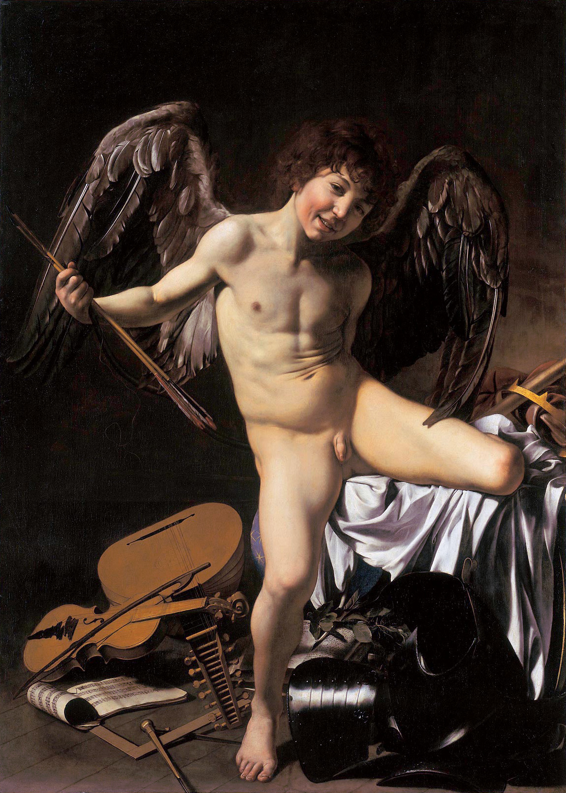
I have alway been of the opinion that beauty is a safe option of approaching the question of what art is. Of course, there is the problem of definition of beauty and, leaving aside the old chestnut that it is in the eye of the beholder, that beauty is bound by culture and very culture has its own idea of beauty. Actually I do not believe this and good case can be made that beauty is more universal and tied to biology and visual psychology. Hence, we can find art from other cultures beautiful. Two recent books make this case far better than I: one, The Art Instinct (2009) by the late Denis Dutton and, two, The Origins of Creativity by Edward O. Wilson (2017), but there many others as well. My point being is that I am not being original in the idea that beauty is universal and common to us all whether one admits to it or not. Beauty is related to pleasure and pleasure is good thing therefore a good painting invokes pleasure and is a good thing. Certainly, a good painting can also invoke ideas beyond beauty and the best paintings do.

Now, what is the job of art? Is it beyond invoking the well being of pleasure? Pleasure can be enough and is something that is needed by the human race. Visual art is not the only thing that can bring us pleasure. There is literature, poetry, music, drama, and let’s not leave out sex from the long list. Again, I will limit my arguments to painting. I do understand that there were, and are, societies where idea the idea of painting does not exist, I assume that they have a concept of beauty.

Back to the job description of art. Aesthetics are at the root of what art does. I taught a course on the principles of art criticism that included the philosophy of beauty for most of my career as a university professor. It covered Western philosophers from roughly around Plato to Heidegger. Yes, I realize that it was a bunch of dead white guys, but that was made clear in the course description and there is only so much you can cover in twenty-six weeks. Yes, there is philosophy other than Western philosophy and there is a sex other than men who are and were philosophers. My students were made aware of the exclusions and we did discuss why these exclusions were central to egocentric Western thought as it evolved. What was discussed was the aesthetic object and how it was perceived as the beautiful over period of roughly two thousand years.

The aim of the beautiful is to achieve a certain sense of bliss, or whatever you want to call it, through some sort of stimulus and the case of my argument here is that a stimulus can be a visual art object. That defines the major job of an art work. Some art succeeds in doing this job and some do not. Again, leaving content aside, the art work that does not possess beauty, while perhaps worthy, is not art, but something else. There is much more to be said than is covered in this short article.

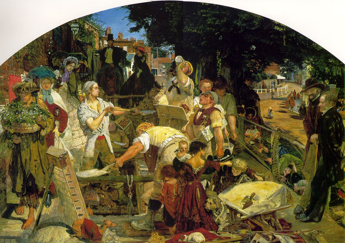
Work (Manchester) by Ford Madox Brown 1865

h1

How brightly gleams the morning star

October 16, 2018

Wie schön leuchtet Morgenstern

BWV 1

A friend who helped to edit the prologue to this project told me that I lost, and bored, her with my attempt at trying to explain the Bach catalogue system; the BWV (Bach-Werke-Verzeichis or Bach-Works-Catalogue) numbers. I told her that there was a reason for the tedium of my prose.

The first cantata, BWV 1, is nowhere near the first cantata that Bach wrote. BWV 1 was first perform on March 25, 1725 for the feast day of the Annunciation and in that year also Palm Sunday. Bach was born in 1685 and died in 1750. He wrote his first cantata around 1707. BWV 1 is the last cantata of the Year II or second cycle, of three cycles of cantatas. I will get into more detail of system as this project proceed. But writing about the cantatas, and works of art, starting with BWV 1 seemed has a good a system as any.

You might think that I would match only realistic religious art to Bach’s religious music and I will do a fair amount of that, as I do like religious art, but I plan to match paintings of all kinds to his cantatas. I am limiting my matches to only paintings because I like painting, it is my project, and I might as well enjoy myself. The only limit is that I am picking only paintings that I have actually seen. This is a project about recall. I have been collecting this music for nearly sixty years and I have been looking at art for even longer. This is an exercise in using my brain while it still works and an attempt to keep it working. It is all being done from my home office in Sackville, New Brunswick.

Back to Bach and the Annunciation. I have multiple versions of many Bach cantatas. I have three versions of Wie schön leuchtet Morgenstern, BWV 1. They are conducted by Nicolaus Harnoncourt (1972), Helmuth Rilling (1980), and Masaaki Suzuki (2006). I have nearly complete sets of the cantatas by Harnoncourt and Suzuki. Friends of mine have often asked why I have several versions of the same classical works in my music collection. That is because the interpretations are quite different. In this case the timing of BWV 1 goes from 25’ 12” (25 minutes 12 seconds) to 22’ 55” to 22’ 23” and, in this case, in the same order that they were recorded from 1972 to 2006. The timing became faster over over the thirty-four years between three versions of the work. Tempo is not everything. There are other major difference between the three versions.

Harnoncourt attempts to record the music in the style that he thought how the work originally was performed. He uses actual instruments from the period; he conducts from the first chair, playing either violin or violoncello; it is small baroque orchestra, the Concentus Musicus Wien and; finally he uses only mens and boys voices for all vocal parts. The Harnoncourt set I own is on vinyl while the Suzuki set is on CD as is Rilling’s recording of BWV 1. I will go into detail about Suzuki’s and Rilling’s interpretations of Bach’s works in later posts, but briefly they use more modern instruments and both male and female voices.

I find it difficult to pick favourite versions of the cantatas that I have in multiple recordings. I do like Harnoncourt’s use boys choirs and men and boys soloists. It gives the music a strange quality that is hard to describe. I have a separate Teldec CD Voices of Angels from 1993 that is all boys voices of selections of Bach’s coral music conduced by Harnoncourt and Gustav Leonhardt that, if you can find a copy, will knock your socks off. (An aside, because of copyright restrictions I cannot include music in my postings. You can find Bach’s cantatas on YouTube, but not necessarily in the versions that I am writing about. They will, however, give you an idea of the music.)

BWV 1 opens with a chorus followed by a recitative, aria, recitative, aria, and finally a chorale. The first line of the chorus is, “How beautifully shines the morning star,…”; that supplies the title of the cantata, a pattern that is common to all of his cantatas. In this cantata the vocals, outside the chorus and the chorale, are sung by individual voices: tenor, soprano, bass, and tenor again respectively. Of course, the text relates to the Annunciation and to both the old (Isaiah) and new (Luke) Testaments. This is a beautiful calm work that washes over me. I have played it repeatedly to go to sleep to. I keep a stack of CDs in my bedroom that play as I try to fall asleep. Bach is a wonderful elixir for all ills.

Let me bring up another date, almost three centuries before, May 6th, 1432, that is the date that Jan van Eyck’s Ghent altarpiece, the Adoration of the Mystic Lamb, was completed. The first time I saw this work was in 1973 and I have revisited it many times since. It has since its inception been housed in St. Bavo Cathedral in Ghent, Belgium. (Except the times it has been carted away by different conquerors as spoils of war, but that is another story for another time.) It is considered as Belgium’s most treasured art work. I was lucky enough to have seen it in its original location in the cathedral before it was moved and placed in a humidity controlled glass box. The first few times I saw the work an old man would come out and opened the altarpiece and then, after a half hour or so, close it again. Of course, the absence of glass was a big thing, but what was more important was that the work was where it belonged and the lighting in the painting aped the natural light in the chapel where it was housed. I will come back to this work I am sure over the duration of this project. It is an art work that has the ability to move me tears.

One part of this truly magnificence polyptych is a portrayal of the Annunciation. It is in the centre of the second story of the closed altarpiece. The scene covers four panels. On the far left is the Archangel Gabriel and, the far right, Mary. The centre panels offer a view, through windowed archways, of a 15th century city, likely Ghent, as seen from above. What is common to 14th to 17th century Flemish religious painting are hidden levels of meaning that if you understand Christian iconography are made clear and there is no shortage of hidden meaning in this image of the the Annunciation. It can be complex, but it is fun, to try and figure it some of it out. Here Gabriel holds white lilies that are symbol of the Virgin’s purity.
In the next panel, the view of a town, the marble column that separates the two windows signifies the column that Christ was tied to and flogged prior to the Crucifixion. In the third panel there is a white towel hanging from a rod with twelve stripes which relates to the twelves apostles, and in the final panel a white dove hovers over the head of the knelling Mary which show the presence of the Holy Sprit and the instrument of her impregnation. The text of Gabriel words to Mary are painted in Gothic script, in Latin, from his lips toward her: “Hail who are full of grace, the Lord is with you.” Mary’s answer, toward him, in Latin, only this time backwards and upside down so that God from above may read her reply, “Behold the handmaiden of the Lord.”

Of course, the whole fiction of the scene is artistic invention—a literate Mary and the Archangel present in 15th century Flanders—, but a beautiful one. I am not sure that this particular Bach work was in mind when I first saw van Eyck’s masterpiece many years ago. I am sure that baroque music did fill my head at the time. That and the smell that is unique to Medieval cathedrals did make for a deep spiritual experience that I can remember to this day.

© Virgil Hammock, Sackville, New Brunswick Canada, 16 October 2018.